- Introduction
- Quick Answer
- 1. Start With Business Outcomes, Not Screens
- 2. Understand Users, Segments, and Jobs To Be Done
- 3. Map the End-to-End Product Experience
- 4. Prioritize High-Impact UX Problems, Not Feature Ideas
- 5. Design Flows and Information Architecture Before Visuals
- 6. Create UI Foundations and a Lightweight Design System
- 7. Prototype and Test With Real Users Before Committing Engineering Time
- 8. Ship in Slices and Measure Product Impact
- 9. Build a Healthy Collaboration Model Across Product, Design, and Engineering
- 10. Set Up Continuous Discovery and Iteration
- Final Tips
Introduction
Bay Area startups don’t lack ideas or engineers. What usually stalls growth is a product experience that’s confusing, leaky, or hard to iterate on once it’s in the wild. Investors, customers, and candidates all notice when your UX/UI feels ad-hoc instead of intentional.
A strong UX/UI practice gives you a repeatable way to design, test, and ship product improvements that actually move activation, retention, and revenue—not just make the interface “prettier.”
This guide walks through how Bay Area teams can treat UX/UI as an operating system for product decisions, from first discovery interviews through design systems, testing, and ongoing iteration.
Quick Answer
Quick Answer: Bay Area startups should treat UX/UI as a structured, repeatable product engine: tie every UX decision to core business outcomes, deeply understand user jobs and journeys, prioritize the few high-impact problems worth solving, design flows and UI patterns in a system (not one-off screens), prototype and test with real users before full build, ship in small slices with clear metrics, and run a continuous loop of discovery, experimentation, and iteration across product, design, and engineering.
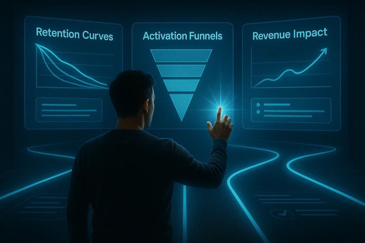
1. Start With Business Outcomes, Not Screens
Before opening Figma, clarify what “good UX/UI” must achieve for the business in the next 6–12 months. For Bay Area startups, this is usually about speed to product–market fit and efficient growth, not visual polish.
Anchor UX/UI work to concrete outcomes such as:
- Activation:
Increase “aha moment” rate (e.g., users completing a core action in first session).Reduce time-to-value for new signups or onboarded accounts. - Retention:
Improve day-7, day-30, or week-12 retention for key segments.Increase adoption of stickiest features (dashboards, workflows, collaboration tools). - Revenue:
Raise trial-to-paid conversion or self-serve upgrade rates.Increase average contract value by clarifying tiers and feature value.
From there, define:
- A primary “North Star” metric (e.g., activated accounts per week, retained teams after 90 days).
- 2–3 supporting UX metrics (e.g., task completion rates, time on core flow, drop-off at key steps).
Every major UX/UI initiative should be able to answer: Which metric is this moving, and how will we measure that within 2–4 weeks of shipping?
2. Understand Users, Segments, and Jobs To Be Done
In the Bay Area, your users are often sophisticated: founders, operators, data teams, or developers. They move quickly and will churn quietly if the product doesn’t match their mental model.
You don’t need a long research project, but you do need a sharp understanding of jobs-to-be-done and user segments:
- Identify primary segments
Example for B2B SaaS: founders, product managers, ops managers, end-user contributors.Prioritize 1–2 primary economic buyers and 1–2 primary day-to-day users. - Run lean interviews and contextual inquiry
5–8 interviews per key segment is often enough to see strong patterns.Focus on:
What triggers them to look for a tool like yours.What “success” looks like 90 days after adoption.Their current workflows, hacks, and workarounds. - Capture jobs, pains, and desired outcomes
Jobs: “I need to…” (e.g., “quickly understand what’s blocking our funnel”).Pains: “It’s hard because…” (e.g., “the data is scattered across tools”).Outcomes: “I’ll be happy when…” (e.g., “I can see live metrics without pinging the data team”). - Turn insights into UX requirements
Required capabilities (what must be possible).Required constraints (what must be easy, safe, compliant, or fast).Required signals (what feedback users need at each step).
This research should map directly into your journey maps, prioritized problems, and design requirements—not sit in a separate “research” folder.
3. Map the End-to-End Product Experience
Most UX problems come from teams only looking at individual screens instead of the whole journey. For Bay Area startups, this journey usually crosses marketing, product, sales, and sometimes onboarding / customer success.
Create simple, high-leverage journey maps:
- Pick one primary journey to start
Example: “From first website visit → activated account.” - Outline key stages
Discover → Evaluate → Signup → Onboard → First Value → Habit → Expansion. - For each stage, capture:
User goal (“What are they trying to accomplish here?”).Product touchpoints (pages, flows, emails, sales calls, docs).Key questions and fears (e.g., “Will this integrate with our current stack?”).Breakpoints and friction (where people drop or hesitate).
Then decide:
- Which stage, if improved, would create the biggest lift in activation, retention, or revenue right now?
- Which stage is most broken versus competitors or user expectations?
That focus becomes the backbone of your UX/UI roadmap.
4. Prioritize High-Impact UX Problems, Not Feature Ideas
Bay Area teams often have a backlog of feature requests from investors, big logos, and internal stakeholders. A UX-first approach means you prioritize problems, not features.
Create a problem backlog:
- Each item framed as: “Users in segment X can’t easily Y, resulting in Z negative outcome.”
- Tag each with:
Impact (on activation, retention, revenue).Confidence (how well you understand the problem).Effort (for design + engineering).
Use a simple prioritization model (e.g., RICE or Impact / Effort) to rank problems. Then:
- Pick 1–3 high-impact problems per quarter as UX/UI initiatives.
- Defer or drop items where impact is unclear or based only on internal opinions.
A useful rule for early-stage startups: if you can’t point to a specific part of the journey that improves and a metric that should move, it’s not a priority UX problem yet.
5. Design Flows and Information Architecture Before Visuals
Good UI is built on good UX structures: flows, hierarchy, and content. Especially for technical or data-heavy products, this has more impact than choosing the right shade of blue.
Focus on three layers first:
- User flows
Diagram steps from entry → completion for core tasks (e.g., “Invite teammates,” “Create first project,” “Export report”).Include system states and edge cases (empty, error, loading, success). - Information architecture (IA)
Define how navigation, pages, and subpages are organized.Keep top-level navigation simple, aligned to user mental models, not internal team structures.Avoid overloading global navigation with rarely used items; push those deeper. - Content and messaging
Write or outline the actual microcopy: button labels, field names, error messages, tooltips.Aim for language your users naturally use in interviews and calls.
Only once flows and IA feel solid do you move into mid-fidelity wireframes and then visual design. This reduces expensive rework later.
6. Create UI Foundations and a Lightweight Design System
Bay Area startups need to move fast across multiple teams and experiments. A lightweight design system keeps UX/UI consistent and speeds up delivery. It doesn’t have to be a huge project.
Start with just enough system to support your core journeys:
- Foundations
Color tokens (with semantic names like “primary,” “danger,” “background”).Typography scale (sizes, weights, line heights).Spacing and grid system. - Core components
Buttons, inputs, dropdowns, status badges, modals, toasts.Form layouts and validation patterns.Navigation (top bar, sidebar, tabs, breadcrumbs). - Usage guidelines
When to use which button style (primary vs secondary vs destructive).How to handle empty states, errors, and loading consistently.Accessibility basics (contrast, focus states, keyboard navigation).
Keep the system lean and practical:
- Add components only when you see repeat usage.
- Tie system updates to real product work, not a separate “design system quarter.”
- Ensure engineers have clear specs (tokens, component props, edge cases).
A solid but pragmatic system makes it easier to run experiments without fragmenting the UX.
7. Prototype and Test With Real Users Before Committing Engineering Time
Testing doesn’t need a lab or weeks of planning. For Bay Area teams, time is the scarce resource, so focus on fast, structured learning that derisks big UX/UI decisions before build.
Use a mix of methods depending on risk and fidelity:
- Low-fidelity prototypes (sketches, wireframes)
Great for testing flows, information hierarchy, and labels.Show to 3–5 users per iteration; watch where they hesitate or misinterpret. - Interactive high-fidelity prototypes
Use Figma or similar to simulate key flows.Useful when UI details or interactions might strongly affect comprehension or trust.
In each test session:
- Give a realistic scenario (“Imagine you’re trying to onboard a new team…”).
- Ask users to think aloud as they perform tasks.
- Observe time to complete, errors, and points of confusion.
- Ask a few targeted questions afterward (“What would you expect to happen next?”).
Synthesize findings into specific UX changes:
- Clarify labels, group fields differently, change hierarchy, add contextual help.
- Remove or postpone features that create cognitive load without clear value.
Build the habit: no major UX change ships without at least a few targeted tests with real users or internal proxies that closely match your audience.
8. Ship in Slices and Measure Product Impact
Big UX redesigns are risky. For fast-moving Bay Area startups, it’s more effective to ship slices: small, coherent improvements that you can measure.
When implementing UX/UI work:
- Define a minimum viable slice
One flow or one stage of the journey (e.g., just the new onboarding checklist, not the whole app). - Instrument key events
Start, success, and failure of the core task.Time between key steps, drop-off at each step. - Set success criteria before shipping
“Increase completion rate from 40% → 55% within four weeks.”“Reduce time-to-first-project by 30% for new teams.”
After launch:
- Watch both quantitative metrics (analytics, funnels, cohorts) and qualitative signals (support tickets, customer calls, NPS verbatims).
- Compare new experiences to old baselines where possible (A/B testing or rolling cohorts).
If an improvement doesn’t move the intended metric, treat that as a learning loop: you either misunderstood the problem, the solution, or the segment. Use that insight to refine the next iteration.
9. Build a Healthy Collaboration Model Across Product, Design, and Engineering
Strong UX/UI in Bay Area startups usually reflects strong cross-functional collaboration, not hero designers.
A few practical patterns that work well:
- Shared problem briefs
Product defines the business problem and success metrics.Design adds user insights, jobs, and journey context.Engineering adds feasibility constraints and tech opportunities. - Working sessions instead of handoffs
Designers, PMs, and engineers co-create flows and tradeoffs in real time.Decisions are documented in a simple spec or design doc. - Clear ownership
Product owns “what problem and why.”Design owns “how it should feel and flow.”Engineering owns “how it works under the hood and how we ship safely.” - Feedback rituals
Regular design reviews focused on user outcomes and clarity, not personal taste.Post-launch reviews on what the change did to key metrics and what to try next.
This reduces back-and-forth, speeds up cycles, and ensures UX/UI decisions are grounded in both user needs and engineering realities.
10. Set Up Continuous Discovery and Iteration
In the Bay Area, market conditions, competitors, and AI capabilities shift quickly. A one-time UX push isn’t enough; you need ongoing discovery and iteration.
Build a lightweight but consistent UX cadence:
- Weekly
Touch at least a few users through calls, interviews, or usability tests.Review fresh product analytics and any new friction points. - Monthly
Revisit the problem backlog and reprioritize based on new learning.Spot early signals of churn risks or power-user behaviors. - Quarterly
Reassess your UX strategy against company goals and roadmap.Adjust the design system and UX guidelines for new platform requirements (e.g., mobile, new integrations).
The goal is to make UX/UI part of how the company operates, not a one-off project. When your team reflexively asks “What problem are we solving? For whom? How will we know if it worked?” before any feature, you know the UX muscle is developing.
Final Tips
Tie UX/UI to money and risk by connecting design work directly to activation, retention, revenue, or reduced operational overhead, and be explicit about tradeoffs since you rarely get simplicity, flexibility, and speed all maximized at once. Design for real constraints from day one by factoring in onboarding capacity, data quality, integration complexity, and security expectations, and favor clarity over cleverness because B2B users typically value predictable, legible workflows. Keep experiments cheap with prototypes, small launches, and focused UX studies so you can learn quickly without overcommitting build time.