The UX and Product Metrics Bay Area Startups Should Track to Connect Design to Activation, Retention, and Revenue


Introduction
Most Bay Area startups track a lot of product analytics, but still struggle to prove what UX changes actually moved the business. The gap is usually not effort, it is structure: teams measure clicks instead of outcomes, or they track outcomes without linking them to specific flows and user segments. This guide lays out a practical metric stack that connects design decisions to activation, retention, and revenue.
Quick Answer
Track UX and product metrics in a simple chain: input metrics that reflect user friction and clarity, activation metrics that prove time-to-value, retention metrics that show habitual use, and revenue metrics that capture conversion and expansion. For most SaaS startups, this means a clear activation moment, funnel conversion and drop-off by step, time-to-first-value, feature adoption for core workflows, cohort retention and churn, and revenue signals like trial-to-paid, seat expansion, and upgrade rate, all segmented by persona, acquisition channel, and plan so design changes can be tied to business outcomes.
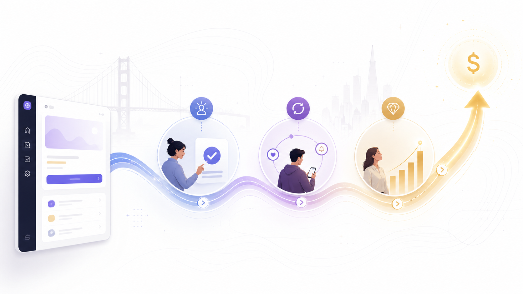
1. Start with a metric stack that matches how design creates business value
Design rarely impacts revenue directly. It usually impacts clarity, speed, confidence, and repeatable behavior, which then impacts activation, retention, and expansion.
Use a four-layer stack so your UX work has a measurable story:
- UX Health (leading): friction, errors, time, comprehension, satisfaction
- Activation (leading to mid): first successful outcome, time-to-value, onboarding completion
- Retention (mid to lagging): habit, repeat usage, stickiness, churn risk signals
- Revenue (lagging): conversion, upgrades, expansion, renewals, ARPA
If you only track the bottom layer, you will always feel like design “cannot be proven.” If you track only the top layer, you will optimize for cosmetics.
2. Define your “activation moment” so design has a measurable target
Activation is not “signed up.” Activation is the first time a user gets meaningful value.
Examples of activation moments:
- Created the first project and invited a teammate
- Imported data and produced the first report
- Completed setup and successfully ran the first workflow
- Connected an integration and saw the first synced result
How to choose the right activation moment:
- It should happen early, ideally in the first session or first day.
- It should correlate with retention or conversion.
- It should reflect the core promise of the product, not a shallow action.
Once defined, every UX decision in onboarding, setup, and empty states can be measured against activation rate and time-to-activation.
3. Track a simple funnel that exposes where UX is blocking activation
For activation, you want a step-by-step funnel that matches your real onboarding path.
A practical activation funnel template:
- Visit landing or app entry
- Sign up or start trial
- Complete key setup step
- Reach activation moment
- Return within 24 to 72 hours
Track:
- Step conversion rate (percentage who move from step to step)
- Drop-off rate at each step
- Time between steps (where users stall)
- Error rate or validation failure rate per step
Then tie UX work to the specific step you are improving. “Improve onboarding” is too vague. “Increase setup completion from 58% to 70%” gives design a win condition.
4. Measure time-to-value because it is where UX often wins fastest
Time-to-value is one of the clearest ways to link UX to business outcomes, especially in competitive Bay Area markets where users abandon quickly.
Track time-to-value as:
- Time from signup to activation moment
- Time from first session to first successful output
- Time from invite sent to teammate first action (B2B)
Useful cuts:
- Median time-to-value (more stable than average)
- Time-to-value by persona (admin vs end user)
- Time-to-value by source (sales-led vs product-led, paid vs organic)
If a redesign does not change conversion but cuts time-to-value in half, you often see retention and expansion improvements later.
5. Track core workflow completion, not just feature usage
Feature adoption is noisy. Workflow completion is meaningful.
Identify 1 to 3 “core workflows” that represent ongoing value, then instrument them end-to-end:
- Start workflow
- Key decision points
- Completion
- Success confirmation (output, saved state, share, export)
Metrics to track per core workflow:
- Completion rate
- Time to complete
- Abandonment point
- Repeat rate (did they do it again within a week)
- Error and recovery rate (how often they hit issues and how they escape)
When a UX change ships, you can directly attribute improvements to completion and repeat rate, which ties cleanly into retention.
6. Retention metrics that actually connect to UX decisions
Retention is where many teams get stuck because they track it too broadly.
Start with cohort retention:
- Week 1 retention for early product-market fit signals
- Week 4 retention for habit and workflow fit
- Month 3 retention for sticky business value (especially B2B)
Then pair it with behavioral retention signals:
- Repeat use of core workflow
- Number of active days per week (frequency)
- Depth of usage (meaningful actions, not clicks)
- Collaboration signals (invites accepted, shared assets, comments, approvals)
UX changes often lift retention by improving repeatability and confidence. That shows up as higher repeat workflow rate and higher active days, not always as a dramatic cohort chart overnight.
7. Engagement metrics that matter for SaaS, without vanity noise
Engagement can be useful if it is tied to value delivery.
Prefer metrics that represent progress and outcomes:
- Meaningful actions per active user (define “meaningful” clearly)
- Active users who complete a core workflow each week
- “Stickiness” as DAU/WAU or WAU/MAU for products with frequent usage
- Saved views, templates, or automation usage (signals of investment)
Avoid:
- Total clicks
- Time in app without context
- Page views inside the product
If you want time-based metrics, use “time to complete workflow” and “time to first value,” which are directly tied to UX.
8. Revenue metrics that design can influence, and how to attribute them
Design affects revenue most predictably through conversion, expansion, and reduced churn drivers.
Revenue metrics to track:
- Trial-to-paid conversion rate
- Plan selection distribution (entry plan vs premium)
- Upgrade rate (feature gated moments)
- Expansion rate (seats, usage-based growth, add-ons)
- Renewal rate and churn rate (B2B)
To connect design to revenue, map UX surfaces to revenue moments:
- Pricing and packaging pages
- Paywalls and upgrade prompts
- Admin billing settings and invoice flows
- In-app “limit reached” experiences
- Downgrade and cancellation flows
A strong Bay Area SaaS pattern is to track “upgrade intent” steps:
- Viewed pricing
- Opened upgrade modal
- Compared plans
- Started checkout
- Completed checkout
This shows where design is leaking revenue before the final payment step.
9. B2B and PLG startups should track account-level metrics, not just user-level
If you sell to teams, user-level metrics alone can mislead you.
Account-level metrics to include:
- Activated accounts (not just activated users)
- Time to first team value (first collaboration event)
- Seats invited vs seats active
- Percent of accounts using the core workflow weekly
- Expansion triggers reached (usage thresholds, team milestones)
- Account health score based on repeat workflow completion
This is where UX often drives revenue indirectly: better collaboration UX increases seat adoption, which increases expansion and renewals.
10. UX quality metrics that reveal friction and guide design priorities
These are your “why” metrics. They explain what is going wrong and where to design.
Track:
- Error rate (validation errors, failed actions, permission issues)
- Rage clicks or repeated clicks (if you track them)
- Backtracks (users reversing steps frequently)
- Support contact rate by workflow (tickets per active account)
- Task success rate in usability tests (even small samples)
- CSAT for key workflows (post-completion micro-surveys)
- NPS if you must, but segment it by persona and lifecycle stage
If activation drops but error rate spikes in setup, you have a clear UX cause. Without these, you are guessing.
11. Segmenting rules so your metrics are actually actionable
Most dashboards fail because they show blended averages.
At minimum, segment by:
- Persona or role (admin, operator, viewer)
- Lifecycle stage (new, recently activated, retained, at-risk)
- Plan tier (free, trial, paid, enterprise)
- Acquisition channel (paid, organic, referrals, sales-assisted)
- Company size (for B2B)
- Device type if relevant (desktop vs mobile)
Design changes often help one segment while harming another. Segmentation lets you simplify decisions and avoid shipping “improvements” that only help the average.
12. Instrumentation basics: event naming, properties, and a clean taxonomy
You do not need perfect tracking, but you need consistent tracking.
A practical event structure:
- Use verb-object names, like “Project Created,” “Report Exported,” “Invite Sent”
- Include properties that matter, like plan, role, team size, workflow type, template used
- Track both success and failure, like “Sync Succeeded” and “Sync Failed”
- Log key states, like onboarding step completed, setup status, permissions granted
Build your dashboards around workflows, not around screens. Workflows map to value, and value maps to business outcomes.
13. A weekly operating rhythm that keeps metrics connected to design work
Metrics only matter if they influence decisions.
A simple cadence:
- Weekly: activation funnel, time-to-value, workflow completion, top friction signals
- Biweekly: cohort retention shifts and adoption of core workflows
- Monthly: revenue conversion, upgrades, expansion, churn drivers tied to UX surfaces
For each UX initiative, define:
- The primary metric (what you want to move)
- Two supporting metrics (what should move if the change works)
- One guardrail metric (what must not get worse)
This turns design into a measurable system instead of a collection of opinions.
Final Tips
If you want to connect UX to activation, retention, and revenue, stop tracking everything and build a metric chain you can explain: activation moment and time-to-value, core workflow completion and repeat rate, cohort retention and churn risk signals, then conversion and expansion tied to specific UX surfaces. When you instrument workflows cleanly and segment by role and plan, design decisions become measurable bets that the whole team can align on.

Book an Intro Call
Frequently Asked Questions
Startups should track activation rate, time-to-value, onboarding completion, setup completion, and drop-off by onboarding step. These metrics show whether new users are reaching the product’s first meaningful value moment or getting blocked before they understand the product. For Bay Area SaaS startups, activation is usually stronger when the metric is tied to a real outcome, such as creating a first project, inviting a teammate, importing data, or completing a first workflow.
Time-to-value is the amount of time it takes a user to experience the product’s first meaningful result after signing up or starting a trial. A shorter time-to-value usually means the onboarding flow, setup steps, empty states, and guidance are doing their job. Startups should track median time-to-value by persona, plan, and acquisition channel so they can see which users reach value quickly and which users need a clearer path.
A startup can tell if a UX redesign improved retention by comparing cohort retention, repeat workflow completion, active usage frequency, and churn risk signals before and after the change. The strongest signal is not just that users return, but that they return to complete the core workflow that delivers product value. For B2B products, account-level retention signals such as team adoption, seats activated, and weekly workflow use are often more useful than individual logins alone.
Workflow completion is usually more useful than feature adoption because it measures whether users finished a meaningful task, not just whether they clicked a feature. Feature usage can be noisy because a user may open a tool once without getting value from it. Workflow completion tracks the full path from starting a task to reaching a successful outcome, which makes it easier to connect UX improvements to activation, retention, and revenue.
UX metrics connect to revenue by showing where design affects conversion, upgrades, expansion, renewals, and churn. Onboarding metrics can influence trial-to-paid conversion, workflow completion can support retention, and clearer upgrade or billing flows can improve revenue conversion. To make the connection measurable, startups should map UX surfaces to revenue moments, such as pricing pages, upgrade prompts, checkout flows, admin settings, and cancellation flows.