- Introduction
- Quick Answer
- 1. Start with the decision you want the screen to support
- 2. Use fewer plans and make the differences obvious
- 3. Make the recommended option helpful, not pushy
- 4. Separate self-serve buyers from sales-led buyers
- 5. Use progressive disclosure instead of dumping every feature at once
- 6. Write pricing copy in plain language
- 7. Reduce anxiety around price, billing, and commitment
- 8. Show comparison where it helps, not everywhere
- 9. Make the primary action match the plan
- 10. Answer objections near the decision point
- 11. Design for scanning before designing for detail
- 12. Test friction points instead of debating them endlessly
- 13. A simple pricing screen checklist for Bay Area SaaS teams
- Final Tips
Introduction
Pricing and plan screens do more than show packages and monthly rates. For Bay Area SaaS startups, they often decide whether a visitor moves forward, asks for sales help, or leaves confused. The best pricing UX makes the next step feel obvious, lowers hesitation, and helps the right buyer choose with confidence.
Quick Answer
Bay Area SaaS startups can reduce friction on pricing and plan screens by making plan differences easy to compare, limiting unnecessary choices, using clear labels instead of internal packaging language, showing who each plan is for, and guiding users toward the next logical action. The best pricing screens reduce confusion by answering common buyer questions before they become objections, and they increase conversions by making the path to self-serve signup, demo request, or sales contact feel clear and low effort.
1. Start with the decision you want the screen to support
A pricing screen works best when it is built around a real user decision, not just around what the company wants to list.
Before choosing a layout, define the main conversion path. In most SaaS companies, that is usually one of these:
- Start a free trial
- Book a demo
- Choose a paid plan
- Contact sales for custom pricing
- Compare self-serve versus enterprise options
The right UX pattern depends on which of those decisions matters most. A product-led startup with a simple self-serve motion should not design its pricing page the same way a complex B2B platform with procurement and security reviews does.
A useful internal question is this: what should the user be able to decide in under 30 seconds? If the team cannot answer that clearly, the pricing screen usually tries to do too much.
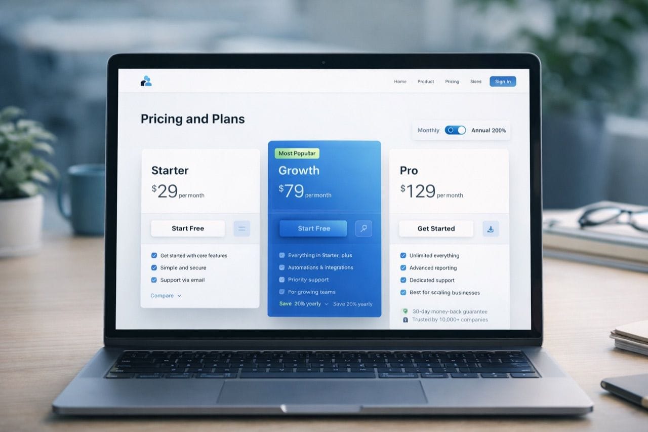
2. Use fewer plans and make the differences obvious
One of the fastest ways to create friction is to offer too many plans that feel too similar.
Most pricing screens work better when they keep the structure simple:
- A limited number of plan choices
- A clear difference between each tier
- One obvious step up in value from one plan to the next
- A clear explanation of who each plan fits
If every plan includes a long feature checklist with only minor differences, the user has to work too hard to understand the tradeoffs. That usually slows conversion.
What usually works better
Instead of forcing users to decode subtle package differences, make the plans feel distinct by showing:
- User type
- Team size
- Main use case
- Level of support
- Depth of features
- Security, compliance, or admin capabilities
For example, a good plan structure often feels more like this:
- Starter for early teams getting set up
- Growth for teams scaling usage and collaboration
- Enterprise for larger companies with security, control, and custom workflow needs
That kind of framing reduces mental load because the user sees themselves in the plan before they start comparing details.
3. Make the recommended option helpful, not pushy
Highlighting a recommended plan is a common pattern because it helps users make a faster choice. But it only works when the recommendation feels credible.
A recommended plan should signal something like:
- Best fit for most growing teams
- Most common choice for teams at this stage
- Right for companies with a specific usage pattern
It should not feel like a visual trick designed only to push the highest price point.
A good recommendation pattern usually includes:
- Slight visual emphasis
- A clear reason for the recommendation
- A plan that genuinely fits a broad middle segment
- Consistent comparison details across all plans
A bad recommendation pattern usually includes:
- Aggressive color contrast that feels manipulative
- No explanation for why the plan is featured
- A highlighted plan that feels obviously overpriced for the likely buyer
- Hidden tradeoffs that only appear later in the funnel
For Bay Area SaaS startups, credibility matters. Smart buyers notice when a pricing page is trying too hard to steer them.
4. Separate self-serve buyers from sales-led buyers
A lot of pricing friction comes from trying to force every buyer through the same screen.
Early-stage founders, small teams, and individual users often want:
- Fast pricing clarity
- Simple plan comparison
- Immediate signup or trial access
- Minimal form friction
Larger teams and enterprise buyers often want:
- Custom scope
- Security and compliance detail
- Procurement support
- Contract flexibility
- A human conversation
Trying to collapse both motions into one generic pricing experience often makes both worse.
A better pattern
Use a pricing structure that clearly separates:
Self-serve path
This should make it easy to:
- Compare plans quickly
- See what is included
- Understand billing terms
- Start immediately
Sales-assisted path
This should make it easy to:
- Understand that custom pricing exists
- See why sales is involved
- Request a demo or talk to the team
- Know what happens next
This split reduces friction because users do not have to guess whether the product is meant for immediate signup or a consultative process.
5. Use progressive disclosure instead of dumping every feature at once
Pricing pages often become hard to use when teams try to answer every possible question in the main comparison grid.
That usually leads to:
- Dense feature tables
- Tiny text
- Long scrolling before the user sees the main call to action
- More detail than most visitors need at first glance
A stronger pattern is progressive disclosure.
Start with the information most buyers need first:
- Plan name
- Price or pricing model
- Main use case
- Key differentiators
- Primary call to action
Then reveal deeper detail only when needed through patterns like:
- Expandable feature categories
- Short linked explanations under unclear items
- Comparison tables lower on the page
- Secondary sections for security, integrations, or usage limits
- Enterprise details behind a clear contact or request path
This keeps the screen easier to scan while still giving serious buyers enough depth.
6. Write pricing copy in plain language
Even well-designed pricing pages fail when the wording is vague, inflated, or too internal.
Confusing pricing language often sounds like this:
- Advanced collaboration stack
- Enhanced activation toolkit
- Flexible monetization layer
- Scalable growth architecture
That language may sound polished internally, but it does not help a buyer choose a plan.
Plain language works better because it answers practical questions faster.
Good pricing copy usually explains:
- Who the plan is for
- What the user gets
- What changes at the next tier
- When a buyer should talk to sales
- Whether setup, onboarding, or support differs by plan
For example, "For teams managing multiple workspaces" is clearer than "Advanced organizational flexibility." "Includes admin controls and approval workflows" is clearer than "Enterprise-grade governance."
The goal is not to make the page sound simple. The goal is to make the decision simple.
7. Reduce anxiety around price, billing, and commitment
Pricing friction is often emotional, not just informational. Users hesitate when they are unsure what they are committing to.
The most common sources of hesitation are:
- Unclear monthly versus annual billing
- Hidden usage limits
- Unclear contract requirements
- Ambiguous trial terms
- Uncertainty about setup costs
- Fear of choosing the wrong plan
Good pricing UX lowers that anxiety directly.
Helpful patterns include:
- Clear monthly and annual toggles
- Visible savings explanation for annual billing
- Short notes on contract terms
- Straightforward usage language
- Easy upgrade and downgrade expectations
- Reassurance around trials, cancellations, or plan changes where relevant
If a startup waits until the FAQ or checkout flow to explain these basics, friction usually rises.
8. Show comparison where it helps, not everywhere
Comparison tables are useful, but only when they support a real question.
A strong comparison table helps users answer:
- Which plan fits my team size?
- What feature unlocks at the next tier?
- Do I need enterprise for this requirement?
- What changes if we scale?
A weak comparison table tries to compare every line item in one oversized grid.
That usually leads to:
- Too much visual noise
- Repeated checkmarks with little meaning
- Important differences buried among minor ones
- More scrolling without more clarity
A better approach is to structure comparison around the differences that actually drive decisions, such as:
- Seats or usage levels
- Core workflow features
- Admin and permissions
- Integrations
- Support level
- Security and compliance
- Reporting or analytics depth
If a feature appears in every plan, it usually does not need to dominate the comparison area.
9. Make the primary action match the plan
One subtle but important pricing pattern is matching the call to action to the plan type.
A self-serve plan usually works best with actions like:
- Start free trial
- Get started
- Choose plan
A higher-touch plan usually works better with actions like:
- Book a demo
- Talk to sales
- Contact our team
The mistake is using the same call to action for every plan when the buying motion is different. If an enterprise plan says "Get started" but still leads to a long sales process, the page creates false expectations. If an easy self-serve plan says "Talk to sales" too early, conversion can drop because the effort feels too high.
The action should feel like the natural next step for that plan, not a generic button repeated across the page.
10. Answer objections near the decision point
Pricing screens convert better when they answer predictable objections before the user leaves to find answers somewhere else.
Common pricing objections include:
- Which plan is right for my team?
- Can we upgrade later?
- Do you charge by seat, usage, or workspace?
- What if we need security reviews or procurement?
- Is onboarding included?
- Do integrations change by plan?
- Is there a free trial or pilot option?
You do not need a huge FAQ block directly under every plan card, but you should answer the most important objections near the decision area.
Useful patterns include:
- Short plan helper text
- Small notes under pricing
- A concise comparison section
- A short objection-handling block below the main pricing cards
- A clear enterprise explanation for larger buyers
This reduces friction because buyers can keep moving without opening a new tab or waiting for sales.
11. Design for scanning before designing for detail
Most visitors do not read pricing pages carefully on the first pass. They scan for signals.
That means the page should make these elements easy to find immediately:
- Plan names
- Price or pricing model
- Recommended option
- Key differences
- Primary action
- Billing toggle
- Enterprise path if relevant
A clean scanning structure often looks like this:
Top section
- Headline
- Short positioning sentence
- Monthly or annual toggle
- Core plan cards
Middle section
- Comparison details
- Feature differences
- Clarifying notes
Lower section
- Objection handling
- Enterprise details
- Extra context for teams with more complex needs
This works better than hiding key plan information inside tabs, hover states, or overly compressed cards.
12. Test friction points instead of debating them endlessly
Pricing screens are full of decisions teams love to argue about. But many of those decisions are better tested than debated.
Good candidates for testing include:
- Number of plans
- Recommended plan placement
- Monthly or annual toggle default
- CTA wording
- Plan naming
- Feature grouping
- Whether pricing should be visible or partially gated
- Enterprise section placement
The goal is not constant redesign. It is identifying which pattern choices actually reduce hesitation and improve movement into the next step.
A useful review framework is to watch for where users pause, bounce, or ask sales the same question repeatedly. Those are often signs that the pricing screen is creating confusion the team can fix.
13. A simple pricing screen checklist for Bay Area SaaS teams
Before publishing or redesigning a pricing page, use this checklist.
Clarity
- Is it obvious who each plan is for?
- Are the differences easy to understand fast?
- Is the recommended plan explained clearly?
Friction reduction
- Are billing terms easy to understand?
- Are hidden limits or commitments reduced?
- Are likely objections answered near the decision point?
Conversion support
- Does each plan have the right next step?
- Is the self-serve path fast enough?
- Is the enterprise path clear enough?
Usability
- Is the page easy to scan in under a minute?
- Are details layered instead of dumped all at once?
- Does the comparison area focus on meaningful differences?
Trust
- Does the pricing feel credible?
- Is the copy specific and plain?
- Does the page avoid manipulative or confusing patterns?
If a pricing page scores weakly in any of those areas, it usually needs simplification more than it needs more design polish.
Final Tips
The best pricing and plan screens reduce friction by making the user feel oriented, informed, and confident at every step. For Bay Area SaaS startups, that usually means fewer choices, clearer plan logic, better objection handling, and a pricing experience that matches how different buyers actually decide.