The Visual Identity Elements That Matter Most for AI, SaaS, and Deep-Tech Startups in Silicon Valley


Introduction
In Silicon Valley, visual identity is judged like product quality. Your brand needs to look credible in an enterprise deck, stay clear at UI sizes, and stand out in a crowded AI and SaaS landscape where many companies share the same minimalist templates. The goal is not “pretty design.” It’s a repeatable system that improves trust, clarity, and differentiation across the surfaces where buyers actually encounter you.
Quick Answer
The visual identity elements that matter most for AI, SaaS, and deep-tech startups in Silicon Valley are a high-utility logo system, UI-first typography, a color system designed for dark mode and accessibility, a consistent layout and spacing system, and a scalable icon plus diagram style for explaining technical value. These elements win because they show up everywhere: product, website, deck, docs, and partner pages. If your identity works at small sizes, in one color, and in real product screens, it will scale.
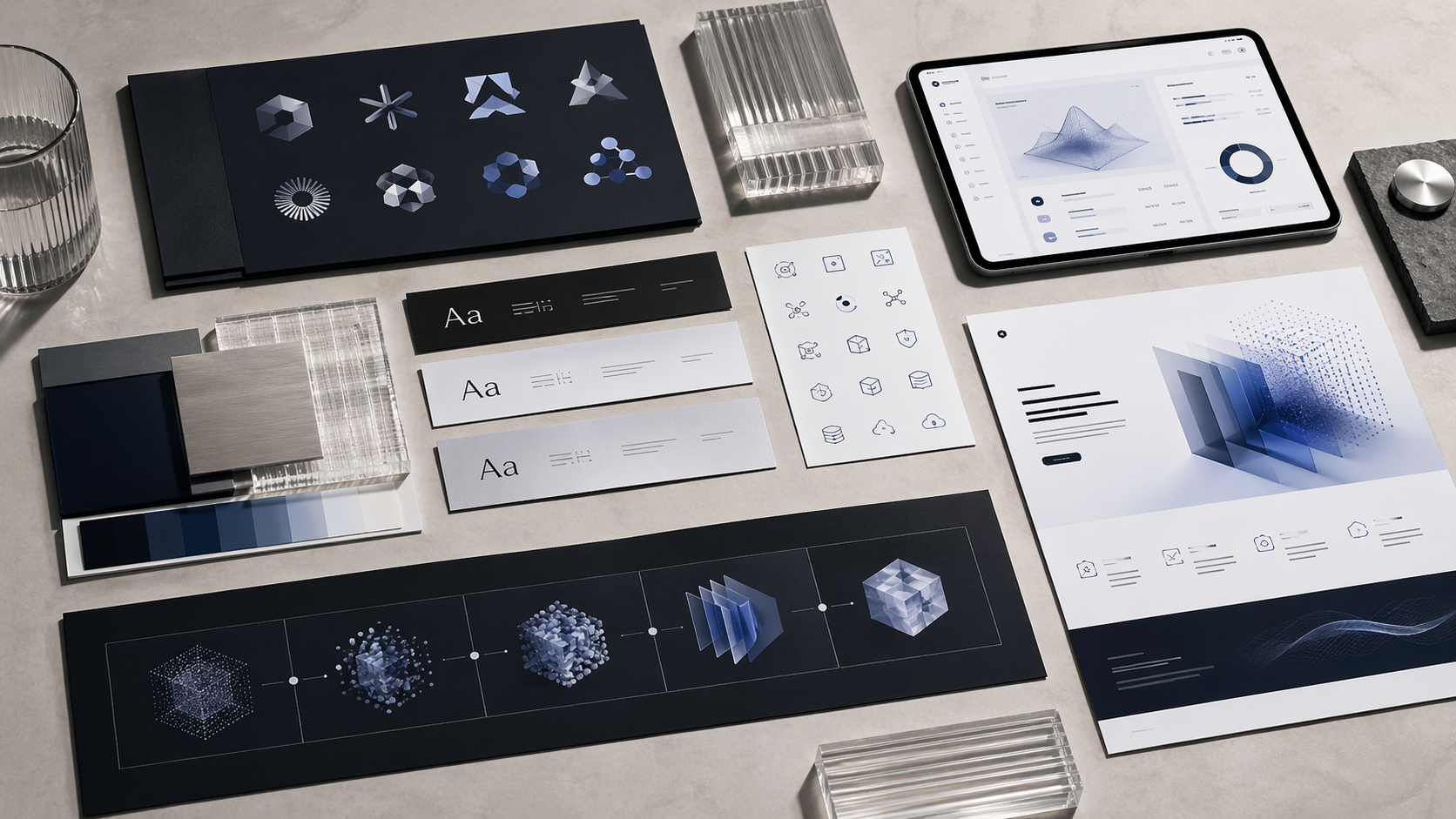
1. Logo system engineered for product surfaces
Your logo lives in favicons, app icons, UI headers, and integration directories more than in marketing hero sections.
What to build
- Wordmark: readable, well-spaced, not “default font” looking
- Small-size mark: monogram or symbol that holds at 16–32px
- Lockups: horizontal and stacked options
- One-color versions: black and white that remain recognizable
- Dark mode variants: deliberate versions, not ad-hoc edits
Fast pass/fail tests
- Shrink to 16px and 24px. If it blurs, simplify.
- Convert to one color. If it loses identity, rebuild.
- Place next to 10 competitor logos. If it blends in, it’s not distinctive enough.
2. Typography that carries trust from UI to enterprise docs
For tech brands, typography is often the identity. It determines clarity, tone, and perceived maturity.
What matters most
- UI-first readability: strong at small sizes in tables, nav, forms
- Clear hierarchy: consistent sizes for headings, body, labels, captions
- Limited complexity: a controlled set of weights and styles
- Predictable rendering: a fallback strategy so it doesn’t break across devices
Practical rule
If your typography doesn’t look great in settings screens and dashboards, it’s not ready for Silicon Valley product reality.
3. Color system built for dark mode, accessibility, and restraint
Color should make your brand usable, not just recognizable. Many startups fail here because they design a palette for marketing pages, not for product.
A scalable color structure
- Neutral base: supports readability and UI density
- Primary accent: used consistently for actions and highlights
- Semantic colors: success, warning, error, info for product states
- Dark mode mapping: planned values for backgrounds, text, borders, and accents
Quick reality test
Apply your palette to a dashboard with a table, a chart, an empty state, and an error state, in both light and dark mode. If clarity drops, adjust before you “lock” the palette.
4. Layout and spacing system that creates instant consistency
Most “brand inconsistency” is actually spacing inconsistency. A layout system gives you polish without adding visual noise.
Define these once
- Grid: web and deck column rules
- Spacing scale: a small set of spacing tokens for margins and padding
- Corners and borders: consistent radius and border treatments
- Content patterns: hero structure, section blocks, feature rows, comparison blocks
Why this is high leverage
When layout is consistent, everything looks more credible, and your team produces assets faster with fewer design debates.
5. Icon and diagram language for technical explanation
AI and deep-tech companies win by explaining complex value clearly. Your identity needs a visual language for concepts, not just decoration.
What to standardize
- Icon style: stroke weight, corner treatment, filled vs outline, sizing rules
- Diagram style: nodes, arrows, labels, line weights, spacing
- Annotation rules: how you label, highlight, and simplify flows
The deep-tech litmus test
If you cannot explain your workflow or architecture in one consistent diagram style across website, deck, and docs, your identity is incomplete.
6. The minimum identity kit Silicon Valley teams actually need
You don’t need an oversized brand book early. You need a kit that prevents drift across product and go-to-market.
Minimum deliverables
- Logo system: wordmark, mark, lockups, one-color, dark mode
- Typography: font stack, hierarchy, usage rules
- Color: neutral base, accent, semantic, dark mode mapping
- Layout: grid, spacing scale, core section patterns
- Icons and diagrams: style rules and a few examples
- Do’s and don’ts: 1–2 pages with real examples
Simple governance rule
Assign one owner to approve new assets and keep the system clean. Without this, even strong identity systems degrade fast at early-stage speed.
Final Tips
For AI, SaaS, and deep-tech startups in Silicon Valley, the identity elements that matter most are the ones you use daily: logo variants that hold at small sizes, typography that reads in UI, a dark-mode-ready color system, consistent layout rules, and a clear icon plus diagram language for technical clarity. Build it as a reusable system, test it in real screens and decks, and you’ll earn trust faster while standing out in a crowded market.

Book an Intro Call
Frequently Asked Questions
You need a logo system that works at small sizes, UI-first typography, a color system with dark mode and semantic states, a consistent layout and spacing system, and a basic icon plus diagram style. If those five elements are consistent across product, website, deck, and docs, you’ll look more credible without overbuilding a brand book.
Prioritize clarity and precision: a restrained typography stack, a calm color system that holds in dark mode, and a diagram style that explains architecture cleanly. Then add distinctiveness through one ownable visual cue, usually a unique logo silhouette or typographic detail, rather than extra decoration.
Most early-stage teams should prioritize a strong wordmark first because it improves recall when you’re still building awareness and reduces confusion in crowded categories. Then add a small-size mark for favicons, app icons, and product UI, keeping it simple enough to read at 16–32px.
Drop your logo, typography, and colors into real UI surfaces like a top nav, sidebar, table view, and error state in both light and dark mode. If readability drops, hierarchy feels inconsistent, or the logo loses recognition at small sizes, your identity system needs simplification and stronger tokens.
Avoid trend stacking and generic abstract marks, and differentiate at the system level: a distinctive logo shape or wordmark detail, a disciplined typography hierarchy, and a consistent icon plus diagram language for technical clarity. Most winners look different because they’re consistent everywhere, not because they’re loud.