
Visual hierarchy is the method by which designers prioritize information on a page so users know what to look at first, what to read next, and what actions to take. It is the invisible guide that shapes attention, reduces cognitive effort, and enhances the overall experience. When applied effectively, visual hierarchy ensures that users understand the value of a product, grasp messaging quickly, and follow intended paths without confusion.
For digital products, e-commerce sites, dashboards, and apps, visual hierarchy is a foundational element of usability and conversion. Poor hierarchy leaves users overwhelmed. Important elements get lost, calls to action are ignored, and engagement drops. Clear visual hierarchy, on the other hand, directs attention seamlessly and creates intuitive experiences. Designers at Ankord Media specialize in helping brands apply these principles strategically, combining aesthetics with functional outcomes.
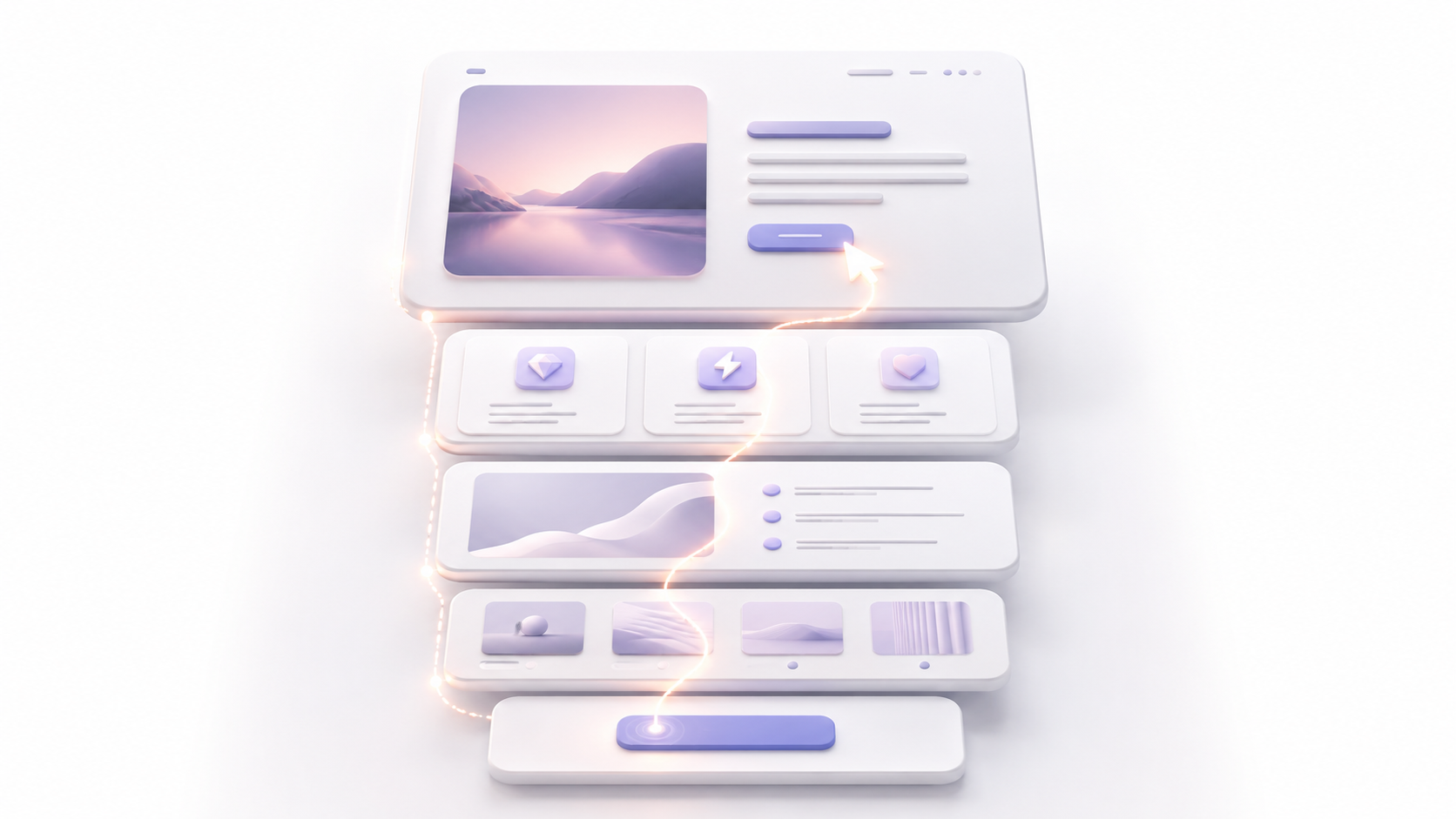
Core Principles of Visual Hierarchy
Visual hierarchy is built around several core design principles that control how attention flows across a page or screen. These principles interact to create an organized, readable, and effective interface.
- Size and Scale: Larger elements naturally attract attention first. Headlines, hero images, and primary calls to action benefit from prominence in size relative to surrounding content.
- Contrast and Color: High-contrast elements stand out. Using bold colors for CTAs or highlighting key messages draws focus while secondary information recedes.
- Positioning and Layout: Placement guides reading patterns. Users typically scan top-to-bottom and left-to-right, so positioning important elements in predictable areas supports natural attention flow.
- Whitespace: Adequate spacing around key elements isolates them from visual clutter, making them easier to notice and comprehend.
- Typography and Weight: Font size, style, and weight communicate importance. Headings should clearly dominate body text, and emphasis can be added through bold or italic styles without overcomplicating the visual field.
By thoughtfully combining these principles, designers create pages that communicate efficiently. Every design choice serves the hierarchy, which reduces cognitive load and improves the likelihood that users take intended actions.
How Visual Hierarchy Influences User Behavior
Visual hierarchy does not only shape what users see—it shapes what they do. Attention naturally follows the cues set by size, contrast, and layout. A user scanning an e-commerce homepage, for example, will notice a prominent sale banner first, followed by product categories, and finally secondary information like blog links or testimonials. Without hierarchy, this flow becomes unpredictable, and users may miss critical actions entirely.
A clear hierarchy also strengthens trust. When content is logically organized, users feel guided rather than overwhelmed. This builds confidence in both the product and the brand. It signals competence, which is particularly valuable for startups and small brands trying to establish credibility. Consistency in hierarchy across multiple pages or screens reinforces the brand’s reliability.
- Improves scanability for users with limited attention
- Reduces time required to find key information
- Highlights the most persuasive content or primary actions
- Encourages predictable reading and interaction patterns
In short, hierarchy directly affects engagement, retention, and conversion because it removes ambiguity from the user journey.
Applying Visual Hierarchy Across Platforms
Visual hierarchy is not limited to desktop websites. Mobile screens, apps, and even email campaigns benefit from the same principles, but the execution differs slightly due to context. Mobile screens are smaller, meaning fewer elements can be prominent at once. Prioritization becomes even more critical. Designers often rely on progressive disclosure by showing essential information first and revealing secondary details gradually.
Consistency is also vital across touchpoints. The same hierarchy patterns should carry from web to mobile to app interfaces, ensuring users understand the visual rules wherever they interact. This creates a seamless experience and helps reduce errors or misinterpretation.
Visual hierarchy also intersects with accessibility. Clear contrast, logical reading order, and well-structured headings improve usability for all users, including those with visual or cognitive impairments. The dual benefit of enhanced attention flow and accessibility makes hierarchy a key factor in both ethical and high-performing design.
Strategic Steps to Establish Effective Visual Hierarchy
Building effective hierarchy is both art and strategy. Start with a clear understanding of user goals and business objectives. What is the single most important action you want the user to take on a page? What secondary information supports that action? Once these priorities are clear, each element’s size, placement, and styling can be adjusted accordingly.
A typical process includes:
- Listing all elements by importance
- Assigning relative weight through size, color, or position
- Testing how users scan the page through heatmaps or usability sessions
- Iteratively refining placement and styling for clarity
- Documenting visual rules for consistent application across pages
Experienced design teams like Ankord Media bring an additional layer of rigor to this process. They assess not just visual appeal, but how hierarchy drives measurable engagement and conversion. By combining aesthetic decisions with behavioral insights, they help brands create systems that perform consistently as they scale.

Book an Intro Call
Frequently Asked Questions
Visual hierarchy is the organization of elements on a page so that users can easily understand importance and follow a natural flow. It prioritizes content visually to guide attention and actions. By establishing and maintaining a strong visual hierarchy, brands can guide users intuitively, reduce confusion, and improve both engagement and conversion. Every design decision communicates priority, and the right visual cues transform complex information into clear, actionable paths.
Clear hierarchy reduces cognitive load, highlights key actions, and directs users through the intended journey. When users see what matters most immediately, they are more likely to take the desired action, such as purchasing or signing up.
Yes. Mobile interfaces benefit from hierarchy by emphasizing essential actions first and using progressive disclosure for secondary content. This helps users navigate efficiently on smaller screens.
Effective designers use hierarchy to guide attention while maintaining brand character through typography, color, and imagery. Skilled agencies like Ankord Media ensure the interface remains functional and on-brand.
Absolutely. Logical reading order, contrast, and clear headings make content easier for all users, including those with visual or cognitive impairments, which improves overall usability and compliance.