- Introduction
- Quick Answer
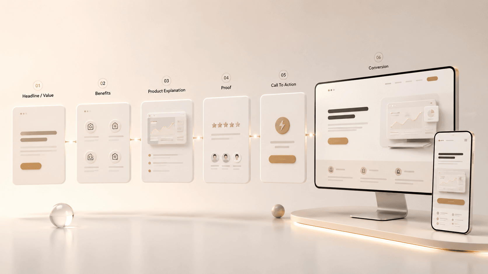
- 1. Decide what the homepage and product page each need to do
- 2. Clarify the message before you write the copy
- 3. Write the homepage from top to bottom like a guided decision path
- 4. Write product page copy to help buyers evaluate fit, not just admire features
- 5. Translate every major feature into buyer value
- 6. Use proof, objections, and CTA copy to improve conversion
- 7. Keep the copy clear for technical, skeptical, and fast-moving buyers
- 8. Avoid the page-level mistakes that quietly kill conversions
- 9. A simple workflow startups can use to improve homepage and product page copy
- Final Tips
Introduction
Bay Area startups often have strong products, smart teams, and clear ambition, but their website copy still leaves visitors unsure what the company actually does or why it matters. That gap gets expensive fast, especially in crowded SaaS and startup markets where buyers compare options quickly and skepticism is high. The goal of homepage and product page copy is not to sound impressive first. It is to make the value clear enough that the right visitor keeps moving.
Quick Answer
Bay Area startups should write homepage and product page copy by making the offer instantly understandable, tying product details to real buyer outcomes, and removing the doubts that block action. The homepage should orient visitors fast by explaining who the company helps, what problem it solves, and why it is different, while product pages should help serious buyers evaluate fit through clearer workflow detail, stronger proof, sharper use cases, and better next-step guidance. Copy that converts usually feels less clever and more useful because it helps people understand the value without extra work.
1. Decide what the homepage and product page each need to do
Many startup websites underperform because the homepage and product page are trying to do the same job.
They should not.
The homepage is the orientation page. It should help a new visitor understand the company fast, see whether it is relevant, and choose the next step.
The product page is the evaluation page. It should help a more serious visitor understand how a specific product, feature set, or solution works, whether it fits their workflow, and whether it is worth exploring further.
That difference matters even more in the Bay Area, where buyers often move quickly, compare several tools at once, and have low patience for vague messaging.
What the homepage should accomplish
- Explain what the company does in plain language
- Make the target audience feel immediately recognized
- Show the core value or outcome
- Establish early trust
- Route visitors to the right next page or action
What the product page should accomplish
- Explain what the product or feature actually does
- Show how it fits into day-to-day workflow
- Translate features into practical value
- Address common objections and buying friction
- Move the visitor toward a demo, trial, signup, or deeper evaluation step
If the homepage is too broad, visitors stay confused. If the product page is too shallow, interested buyers stall.
2. Clarify the message before you write the copy
Weak website copy usually starts with weak message inputs.
Before drafting, Bay Area startups should get aligned on five basics.
Who is this page for
Do not write for every possible user. Write for the buyer or team most likely to care.
Examples:
- founders at early-stage B2B startups
- product leaders at SaaS companies
- RevOps teams at mid-market businesses
- customer success teams with onboarding friction
- technical buyers comparing workflow tools
The clearer the audience, the clearer the copy.
What painful problem are they trying to solve
Name the real operational problem, not the broad category.
Weak:
A modern platform for collaboration
Stronger:
A way for product, engineering, and customer teams to manage launches without scattered updates, delayed handoffs, and unclear ownership
What outcome do they actually want
Buyers are usually chasing a better business state, not just a feature list.
Common outcomes include:
- faster activation
- shorter sales cycles
- fewer manual steps
- better reporting visibility
- cleaner handoffs between teams
- stronger conversion from website traffic
Why is your approach different
This is where a lot of startup copy becomes generic.
Terms like seamless, intelligent, scalable, flexible, and powerful rarely explain enough on their own. Buyers need to understand what is structurally different in the workflow, setup, product design, or operating model.
What proof supports the claim
Proof makes the copy believable.
Useful proof includes:
- customer logos
- customer quotes tied to a result
- quantified outcomes
- screenshots with explanation
- team credibility
- implementation speed
- integration detail
- security or compliance context when relevant
If those inputs are not clear, the page will usually sound vague no matter how polished the writing is.
3. Write the homepage from top to bottom like a guided decision path
A good homepage is not just a set of sections. It is a guided path from uncertainty to confidence.
For Bay Area startups, the biggest homepage mistake is assuming visitors will figure it out if the brand feels smart enough. They usually will not.
Hero section
The hero should answer three questions almost immediately:
- What is this?
- Who is it for?
- Why should I care?
A strong homepage headline is usually clearer when it focuses on the outcome, audience, or problem solved.
Weak:
Work smarter with the future of operations
Stronger:
Operations software for B2B teams that need cleaner handoffs and faster execution
The supporting text under the headline should add context, not repeat the same claim in different words.
Example:
Track tasks, approvals, and launch progress in one place so cross-functional teams can move faster without losing visibility.
Primary call to action
The CTA should match the actual buying motion.
For more complex startup products, stronger options are often:
- Book a demo
- See how it works
- Talk to our team
- Explore the product
For simpler or product-led tools, self-serve options may work:
- Start free
- Try it now
- Create an account
A homepage usually performs better when the CTA matches how ready the visitor is, rather than forcing every reader into the same action.
Early proof block
Trust needs to appear early, especially in a region full of ambitious claims and crowded categories.
Good early proof can include:
- a logo strip
- a short outcome statement
- a customer result
- a credibility line about who the platform is built for
Examples:
- Trusted by growth-stage SaaS teams
- Reduced manual onboarding work by 30 percent
- Used by product and operations teams managing complex launches
Problem section
This section should show the visitor that you understand the current pain.
Good homepage copy names real friction such as:
- delays between teams
- scattered tools
- unclear ownership
- poor visibility into progress
- feature complexity slowing adoption
- too much manual follow-up
This works better than broad statements like "today's teams need more efficiency."
Solution section
Now show what changes with the product.
A strong solution section answers:
- what the product helps teams do
- what becomes easier
- what improves in the business or workflow
- why this approach is better than the status quo
How it works section
Bay Area startups often skip this because they think simplicity means saying less. In reality, serious buyers often need a little more structure to understand the offer.
A short three-step sequence often works well:
- capture the work
- automate the routing
- track the outcome
Even a concise process section can improve comprehension and reduce bounce.
Use case or audience section
This is especially helpful when different buyers care about different things.
Examples:
- for customer success teams
- for RevOps leaders
- for product-led SaaS companies
- for operations-heavy startups
- for technical teams managing complex workflows
This section helps visitors self-select and feel that the page was written for their context.
Final conversion block
The bottom of the homepage should not introduce a brand new message. It should reinforce the core value and make the next step feel easy and logical.
4. Write product page copy to help buyers evaluate fit, not just admire features
A product page should do more than describe functionality. It should help the visitor decide whether the product fits their real situation.
That means the page needs to answer practical evaluation questions.
What does the product actually do
Use plain language before category language.
Weak:
Advanced workflow intelligence for modern scale
Stronger:
Automatically assign tasks, trigger reminders, and show account progress as each onboarding milestone is completed
A buyer should be able to explain the product to someone else after reading the page once.
What problem does it solve in day-to-day work
This is where product pages often get too abstract.
Make the value concrete:
- reduces manual coordination
- gives managers a clearer view of blockers
- prevents handoff delays
- helps teams intervene sooner when progress stalls
- cuts wasted time from status chasing
How does it fit into the buyer's workflow
In startup sales, especially in Silicon Valley and the Bay Area, buyers often need to understand workflow fit before they care about feature depth.
Product pages should clarify:
- who uses the product
- when they use it
- what changes in the workflow
- what systems it touches
- what rollout or setup looks like
This is often the difference between "interesting product" and "usable product."
What makes it better than the alternative
The alternative might be:
- spreadsheets
- internal tools
- disconnected systems
- manual project management
- another point solution
You do not have to name competitors to make your differentiation clear.
You can say things like:
- easier to manage than spreadsheet-based tracking
- more visible across teams than disconnected tools
- faster to launch than a custom internal setup
- easier for lean teams to maintain
What proof reduces risk
Product pages usually need tighter proof than homepages.
Use proof that is tied to the product itself:
- screenshots with captions
- use-case examples
- implementation notes
- customer outcomes
- short quotes tied to a workflow improvement
- security and permissions detail where relevant
For technical and complex products, proof often matters as much as positioning.
5. Translate every major feature into buyer value
One of the fastest ways to improve conversion copy is to stop listing features without explanation.
A better structure is this:
Feature → practical effect → business value
Here are examples.
Shared dashboard → everyone sees status in one place → fewer missed handoffs and faster decisions
Automated reminders → teams stop relying on manual follow-up → less operational drag and fewer dropped tasks
Role-based permissions → the right people access the right data → lower risk and more confidence for larger teams
Integration with CRM and support tools → less duplicate work across systems → cleaner workflows and better reporting continuity
This matters because many startup websites stop at the feature layer. Buyers still need help understanding why the feature matters in their world.
A simple test helps:
After each product claim, ask: so what?
If the answer is not obvious in the copy, keep rewriting.
6. Use proof, objections, and CTA copy to improve conversion
Clear copy explains value. Conversion-focused copy also removes hesitation.
Visitors often do not convert because key doubts are left unanswered.
Common objections Bay Area startups should address
- Is this built for a company like ours?
- Will this work with our current systems?
- Is setup light or heavy?
- Will my team actually use it?
- How long until we see value?
- Is this better than the process we already have?
- Do I need to talk to sales first?
These do not always need to live in a formal FAQ section. They can be addressed naturally throughout the page.
Where proof should appear
Good proof placement usually looks like this:
- early proof near the hero
- product-specific proof near feature or workflow sections
- deeper trust proof near the CTA
This sequence works because belief usually builds in layers.
How to make CTA copy stronger
A weak CTA often feels too generic or too early.
Examples of better CTA alignment:
For early-stage evaluation:
- See the workflow
- Explore key use cases
- View the product
For serious buying intent:
- Book a demo
- Talk through your use case
- See how this fits your stack
For product-led motion:
- Start free
- Try the product
- Create your workspace
The CTA should reflect what the visitor is ready to do, not what the company wishes they would do.
7. Keep the copy clear for technical, skeptical, and fast-moving buyers
Bay Area startup buyers often have a few predictable traits. They are busy, comparison-heavy, and skeptical of inflated claims.
That changes how copy should be written.
Use plain language before layered messaging
A smart audience does not need more jargon. They need faster clarity.
Make the value legible to multiple stakeholders
A founder, operator, product lead, and implementation stakeholder may all read the same page. Good copy makes the value understandable at multiple levels.
Say enough to support evaluation
Many startups under-explain the product because they fear sounding complicated. But buyers evaluating real software often need more context, not less.
Clarity is not about making everything short. It is about making every sentence useful.
Avoid copy that sounds impressive but says little
Words and phrases that often weaken trust:
- next-generation
- revolutionary
- powerful platform
- seamless experience
- cutting-edge solution
- built for the future
These can sometimes appear later in brand copy, but they should not carry the load of the main value proposition.
8. Avoid the page-level mistakes that quietly kill conversions
The most common mistakes are not dramatic. They are just costly over time.
Mistake 1: The headline names a category but not the value
Visitors understand what bucket you are in, but not why they should care.
Mistake 2: The page explains features before the problem
Without problem context, features feel less important.
Mistake 3: The homepage tries to serve every audience equally
This usually creates weak copy for everyone. Use clearer routing and audience cues.
Mistake 4: The product page assumes buyers already understand the workflow
Even interested visitors often need a little more operational detail.
Mistake 5: Proof shows up too late
If a strong claim appears first, trust should follow quickly.
Mistake 6: CTAs are too generic
A vague CTA can lower momentum even when the rest of the page is solid.
Mistake 7: The copy was written in isolation
The best website copy usually comes from:
- founder interviews
- sales call language
- demo questions
- customer objections
- onboarding friction
- win and loss notes
- support conversations
That language is usually more conversion-useful than what comes from a blank page brainstorm.
9. A simple workflow startups can use to improve homepage and product page copy
A startup does not need a massive brand project to improve these pages. It does need a tighter process.
Step 1: Gather raw buyer language
Pull language from calls, demos, support tickets, onboarding notes, and founder conversations.
Step 2: Define the page goal
Be specific.
Homepage goal:
help the right visitor understand the company and move deeper
Product page goal:
help a serious visitor evaluate fit and take the next step
Step 3: Lock the core message
Write down in plain language:
- audience
- problem
- outcome
- differentiator
- proof
- next step
Step 4: Build the section order before drafting
For the homepage, map the journey:
hero, proof, problem, solution, workflow, use case, CTA
For the product page, map the journey:
what it does, who it is for, workflow fit, proof, objections, CTA
Step 5: Draft for clarity before polish
Do not chase clever phrasing too early. Make the page understandable first.
Step 6: Tighten every major claim
Replace vague wording with specifics. Translate features into outcomes. Add proof where belief is thin.
Step 7: Review with someone close to the buyer
A founder, salesperson, product lead, or customer success leader can often spot message gaps faster than a writer alone.
Step 8: Test and improve over time
The best copy usually gets stronger after launch.
Watch for:
- homepage-to-product-page click-through rate
- demo request rate
- trial starts
- bounce rate on key pages
- sales feedback on lead quality
- objections that keep repeating in calls
If a question keeps coming up in sales conversations, the page probably needs to answer it sooner.
Final Tips
Write the homepage to orient and the product page to convince. Keep the value proposition concrete, show how the product fits real workflows, and make proof visible before skepticism has time to grow. The best-performing startup copy usually does not try hardest to sound smart. It works hardest to make the next decision easier.