


- Introduction
- Quick Answer
- 1. Brand Foundation: Positioning, Purpose, and Personality
- 2. Logo System and Usage Rules
- 3. Color Palette and Typography
- 4. Layout, Imagery, and Iconography
- 5. Voice, Tone, and Messaging Basics
- 6. Product and UX Applications
- 7. Channels, Templates, and Real Examples
- 8. Governance, Access, and How to Use the Guidelines
- Final Tips
Introduction
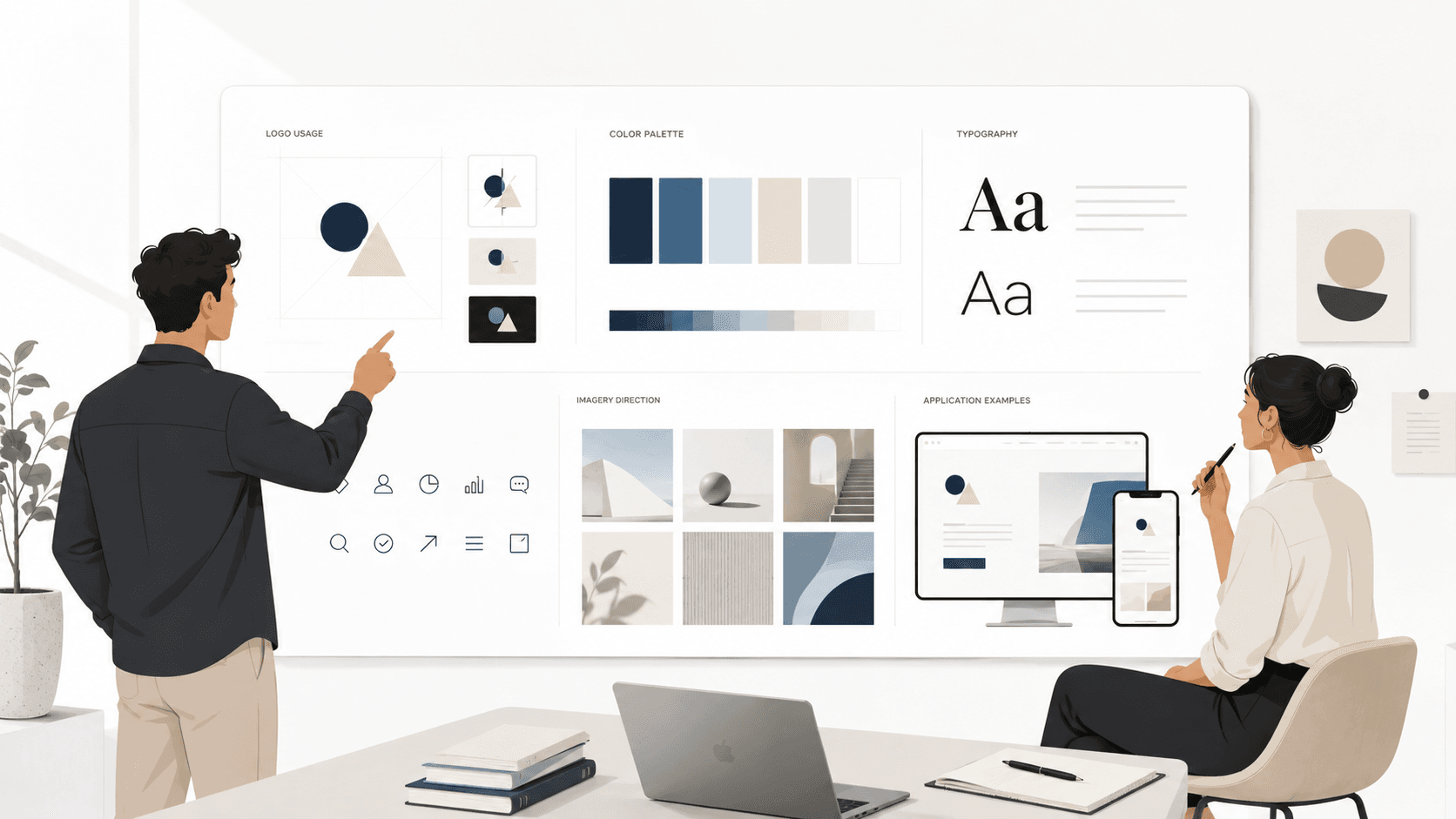
In Silicon Valley, your brand shows up everywhere at once: product UI, pitch decks, sales collateral, hiring pages, and social feeds. As your team grows and more people create assets, the risk of a messy, inconsistent brand increases quickly. A complete brand guidelines document is how you keep everything coherent so designers, marketers, engineers, and founders are all building the same brand. This guide walks through exactly what Silicon Valley founders should include so the brand can scale with the company instead of breaking as you grow.
Quick Answer
A complete brand guidelines document for a Silicon Valley startup should include a clear brand foundation, a defined visual system, practical rules for voice and messaging, product and UX applications, channel specific examples, and simple governance rules. In practice, that means documenting your positioning, personality, and values, defining logo usage, color palettes, typography, layout and imagery systems, spelling out tone of voice and key messages, and showing how all of this applies to your product UI, pitch decks, website, and hiring materials. The result is a single source of truth that lets anyone on the team create on brand work quickly without constant founder review.
1. Brand Foundation: Positioning, Purpose, and Personality
Your guidelines should start with the strategic foundation so people understand what the visuals and words are trying to express.
What to include
- Positioning statement
One or two sentences that explain who you are for, what problem you solve, what category you are in, and how you are different. This should match what you say in investor meetings and on your homepage. - Mission and vision
Short, concrete descriptions of why the company exists and what future you are building toward. Avoid vague inspiration. Make it specific enough that it can guide decisions. - Values and principles
A small set of values that actually influence how you design, write, and ship, not just internal HR statements. For example, clarity over cleverness, customer reality over hype, long term trust over short term clicks. - Brand personality
A simple description of how your brand should feel, such as calm and expert, optimistic and practical, or bold and direct. Include a few adjectives and a short paragraph to bring it to life.
This foundation helps everyone understand the why behind the guidelines instead of treating them like arbitrary visual rules.
2. Logo System and Usage Rules
In a fast moving startup, logos tend to multiply. A clear logo system prevents chaos across product, decks, and external assets.
What to include
- Primary logo
The main logo and when to use it. Show examples on light and dark backgrounds. - Secondary or stacked versions
If you have horizontal, vertical, or icon only versions, define when each is appropriate, such as avatars, favicons, or tight spaces. - Clear space and minimum size
Simple rules for how much space to leave around the logo and the smallest size it can appear without losing legibility. - Do and do not examples
Show common mistakes to avoid, such as stretching the logo, changing colors, adding effects, or placing it over busy images.
Founders should make sure these rules reflect how the logo will actually be used across product, decks, and investor materials instead of being only theoretical.
3. Color Palette and Typography
Color and type are two of the fastest ways your brand looks inconsistent if you do not define them clearly.
Color palette
Include:
- Core brand colors
Usually one or two primary colors and a small set of supporting colors. Provide hex, RGB, and any design token naming you use. - Neutrals and backgrounds
Greys, off whites, or dark backgrounds for layouts and product surfaces. - Functional colors
Colors for states such as success, warning, error, and information if you are a product led company. - Accessibility guidance
Basic rules about contrast and combinations that should be avoided to keep text readable.
Typography
Include:
- Primary typeface
Family name, weights, and where to use them, such as headings, body text, and captions. - Hierarchy examples
A simple scale for H1, H2, H3, body, and small text with sizes, line heights, and spacing. - Usage notes
Rules about capitalization, letter spacing, and whether to avoid decorative fonts.
By documenting colors and type in a way that maps to design tools and code, you make it easier for designers and engineers in Silicon Valley teams to stay aligned.
4. Layout, Imagery, and Iconography
Layout and imagery are where many startups drift away from their own brand, especially when multiple teams create decks and pages.
Layout
- Grid and spacing rules for common formats such as website sections, product screens, and presentations.
- Examples of how to structure information hierarchies, such as how many levels of headings to use and how wide text blocks should be.
Imagery
- Photography style
Describe whether your brand leans toward candid, product focused, or conceptual images. Include a few approved examples. - Illustration style
If you use illustration, define the style, level of detail, and tone, such as playful, technical, or minimal.
Iconography and data visualization
- Style rules for icons, including stroke weight, corner radius, and line style.
- Basic guidance for charts and diagrams so they look consistent in product, blogs, and decks.
The goal is not to micromanage every layout, but to give enough structure that new pages and decks still feel like they belong to the same company.
5. Voice, Tone, and Messaging Basics
Silicon Valley companies often have strong UI design but inconsistent writing. A complete brand guidelines document should make it easier for anyone to write in your voice.
Voice and tone
- Voice description
A short explanation of your default voice, such as direct, warm, and plain spoken. - Tone adjustments
Notes on how tone changes by context, such as more supportive in onboarding, more urgent in alerts, more formal in legal content.
Messaging basics
- Tagline or core promise
The central line that appears in key places like the homepage hero or investor deck cover. - One sentence and one paragraph description
Standard company descriptions for use in press, events, and directories. - Key phrases and terms
Approved terminology for your product, features, and users, plus words you intentionally avoid. - Do and do not examples
A few side by side examples of on brand and off brand writing to give writers and founders a feel for the difference.
Clear voice and messaging guidance helps keep your product, website, and founder communication aligned with the brand strategy you pitched to investors.
6. Product and UX Applications
For a Silicon Valley startup, the product experience is often the most visible part of the brand. Your guidelines should connect directly to UX and UI decisions.
What to show
- Core UI components
Buttons, inputs, cards, tables, and other repeated elements with states, spacing, and usage rules. - Navigation patterns
How top navigation, sidebars, and in product menus should work and look. - In product copy
Examples of how to write labels, tooltips, empty states, errors, and confirmations in your voice. - Onboarding flows
A simple example of how brand, messaging, and design come together when a new user first enters the product.
By including product examples in the brand guidelines, you reduce the gap between marketing and product and make it easier for new designers and engineers to ship features that feel on brand.
7. Channels, Templates, and Real Examples
Guidelines become much more useful when they show how the brand works in real, everyday assets.
High leverage channels to cover
- Pitch deck
Example cover slide, section dividers, and a few slide layouts that reflect your visual system and messaging. - Website
Wireframe or screenshot examples of key pages such as the homepage, pricing, and product overview. - Sales and customer collateral
One pagers, case studies, and proposal documents with basic layout and tone rules. - Hiring and culture materials
Careers page, job descriptions, and internal presentations that reflect the same brand personality.
Where possible, include real or near real examples instead of only idealized mockups. This helps the team see how the rules apply under real constraints.
8. Governance, Access, and How to Use the Guidelines
Even the best guidelines fail if people do not know where they live or how to use them.
Governance essentials
- Ownership
Who owns the guidelines and who can approve changes. This might be a head of brand, marketing, or design, with founder oversight at early stages. - Versioning
Simple rules for how often guidelines are reviewed and how changes are communicated to the team. - Asset library
Links to logo files, templates, type files, and any design system or component library that supports the brand. - How to get help
A short section that tells people where to ask questions or request new assets.
This section turns the document from a static PDF into a living tool that can grow with the company as you add products, markets, and teams.
Final Tips
Treat your brand guidelines as a practical playbook, not a museum piece. Start with a simple but complete version that covers foundation, visuals, voice, product, and governance, then update it as your Silicon Valley startup grows and your brand strategy sharpens. The goal is to make it easier for more people on the team to create consistent, on brand work without needing the founder to approve every slide and screen.